Creating a brand for a banking app targeted at youth.
Creating a brand for a banking app targeted at youth.
Creating a brand for a banking app targeted at youth.


Flexa is a banking app created for young people. With its playful use of colour and simplified layout Figma aims to provide an experience where users can manage their banking safely. This project was a challenge as it was my first time creating a working prototype but I throughly enjoyed the whole process. You can also view the prototyped version here: https://rb.gy/nxncw
Flexa is a banking app created for young people. With its playful use of colour and simplified layout Figma aims to provide an experience where users can manage their banking safely. This project was a challenge as it was my first time creating a working prototype but I throughly enjoyed the whole process. You can also view the prototyped version here: https://rb.gy/nxncw
Flexa is a banking app created for young people. With its playful use of colour and simplified layout Figma aims to provide an experience where users can manage their banking safely. This project was a challenge as it was my first time creating a working prototype but I throughly enjoyed the whole process. You can also view the prototyped version here: https://rb.gy/nxncw
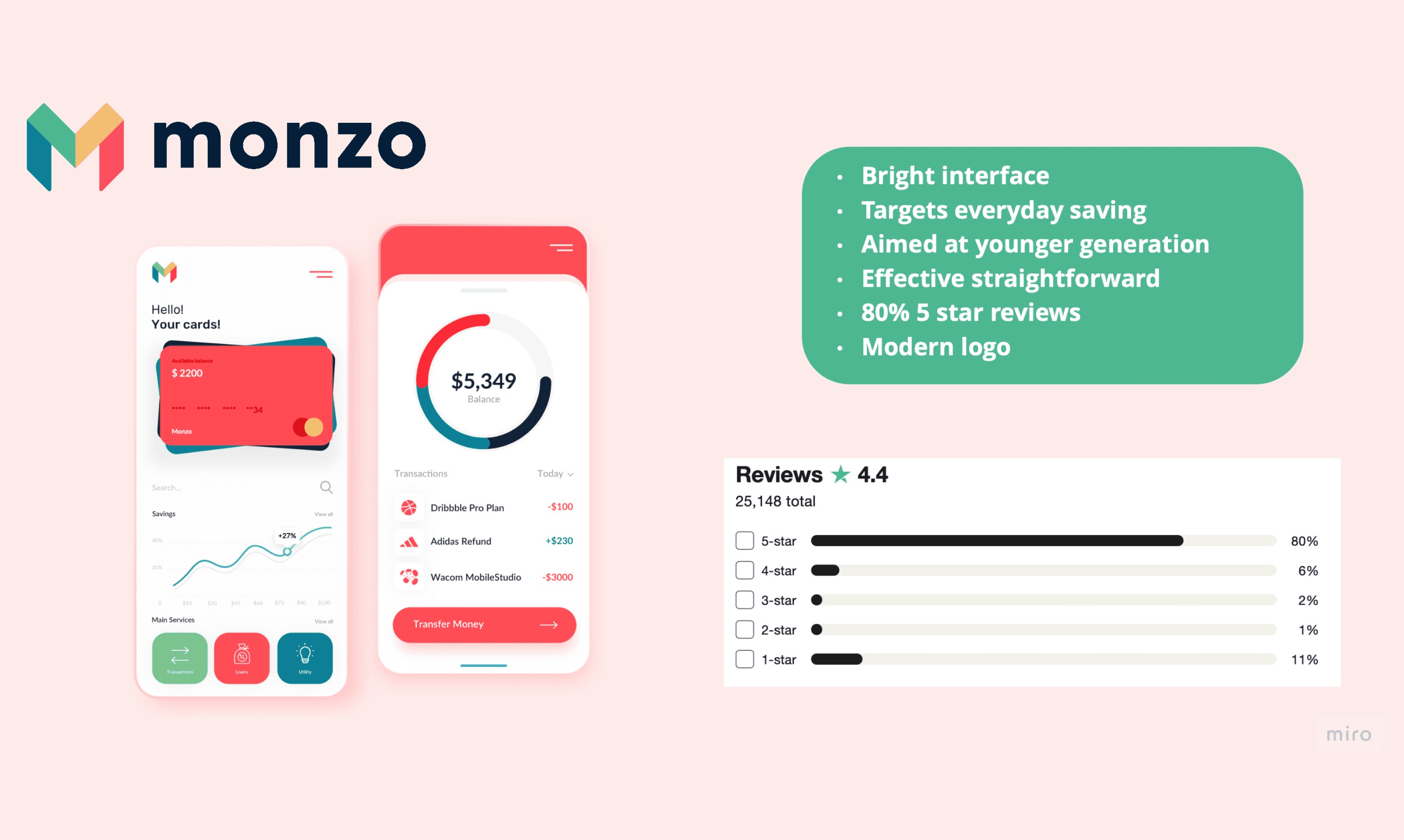
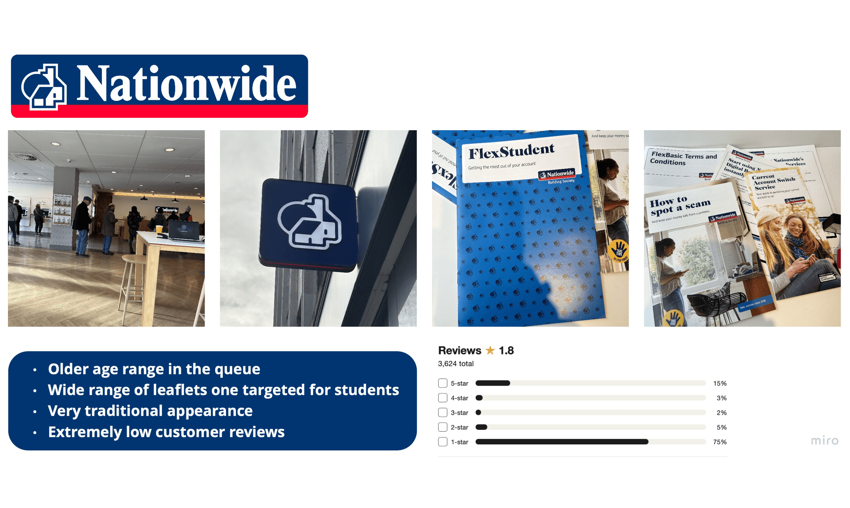
To start off this project I began in depth research. I decided to create two pocket profiles using Nationwide and Monzo for comparison, It is extremely clear to see what the modern digital bank is with the use of colours and graphics compared to the traditional colour theme and typography used for Nationwide. I focused on these two banks as they are well known and reputable.
The Journey




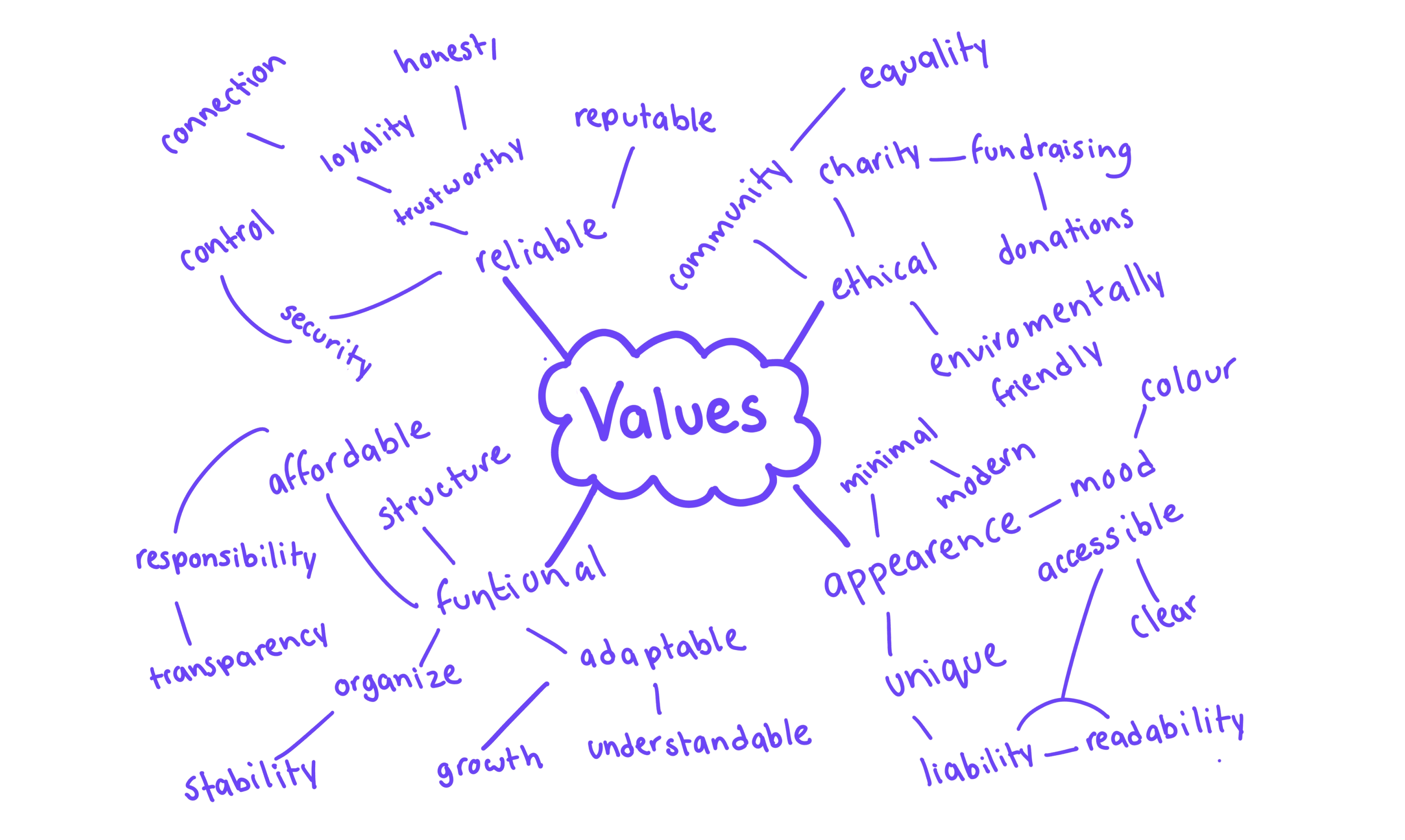
I created a mind map to search out what values mean the most to my banking brand. Brainstorming helped me discover what five values meant the most to my brand.
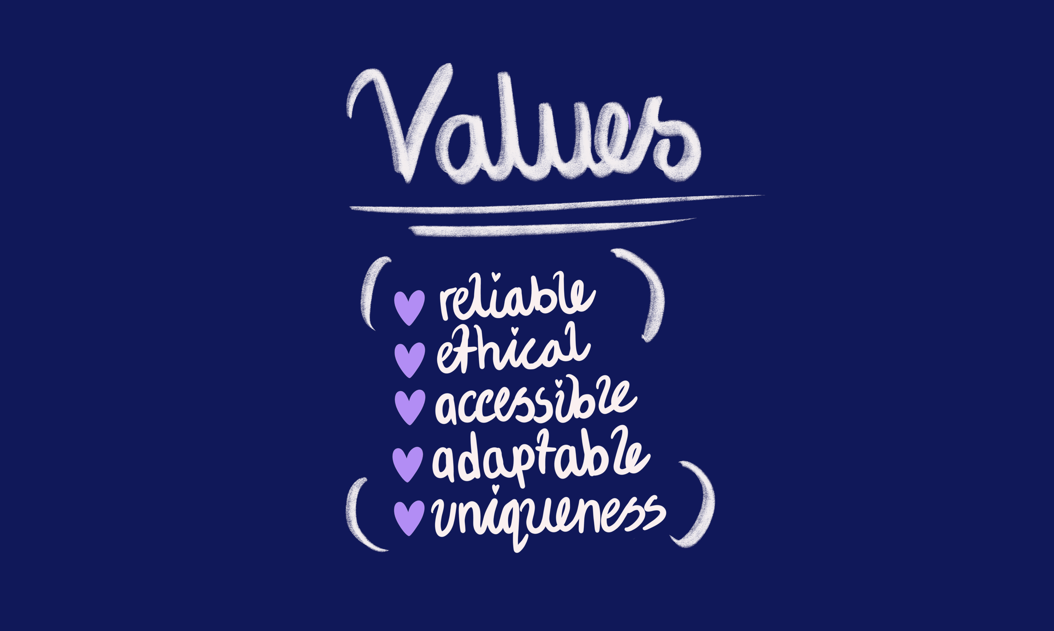
After my mindmap exercise, I've distilled my core values. These five principles will shape my future endeavors.
Finding Values
I created a mind map to search out what values mean the most to my banking brand. Brainstorming helped me discover what five values meant the most to my brand.
After my mindmap exercise, I've distilled my core values. These five principles will shape my future endeavors.
Finding Values
I created a mind map to search out what values mean the most to my banking brand. Brainstorming helped me discover what five values meant the most to my brand.
After my mindmap exercise, I've distilled my core values. These five principles will shape my future endeavors.
Finding Values




Development
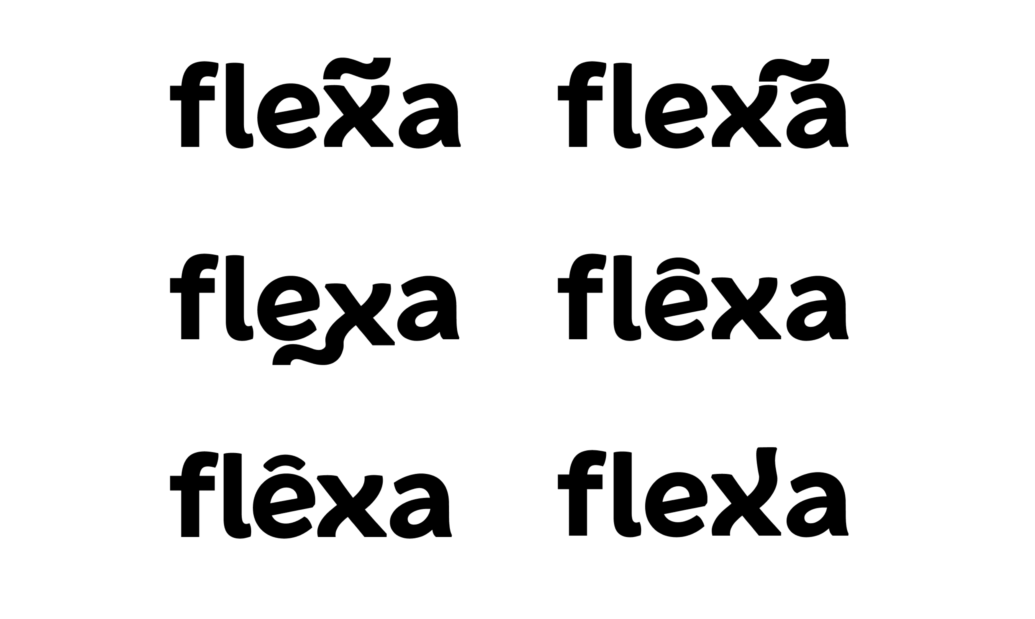
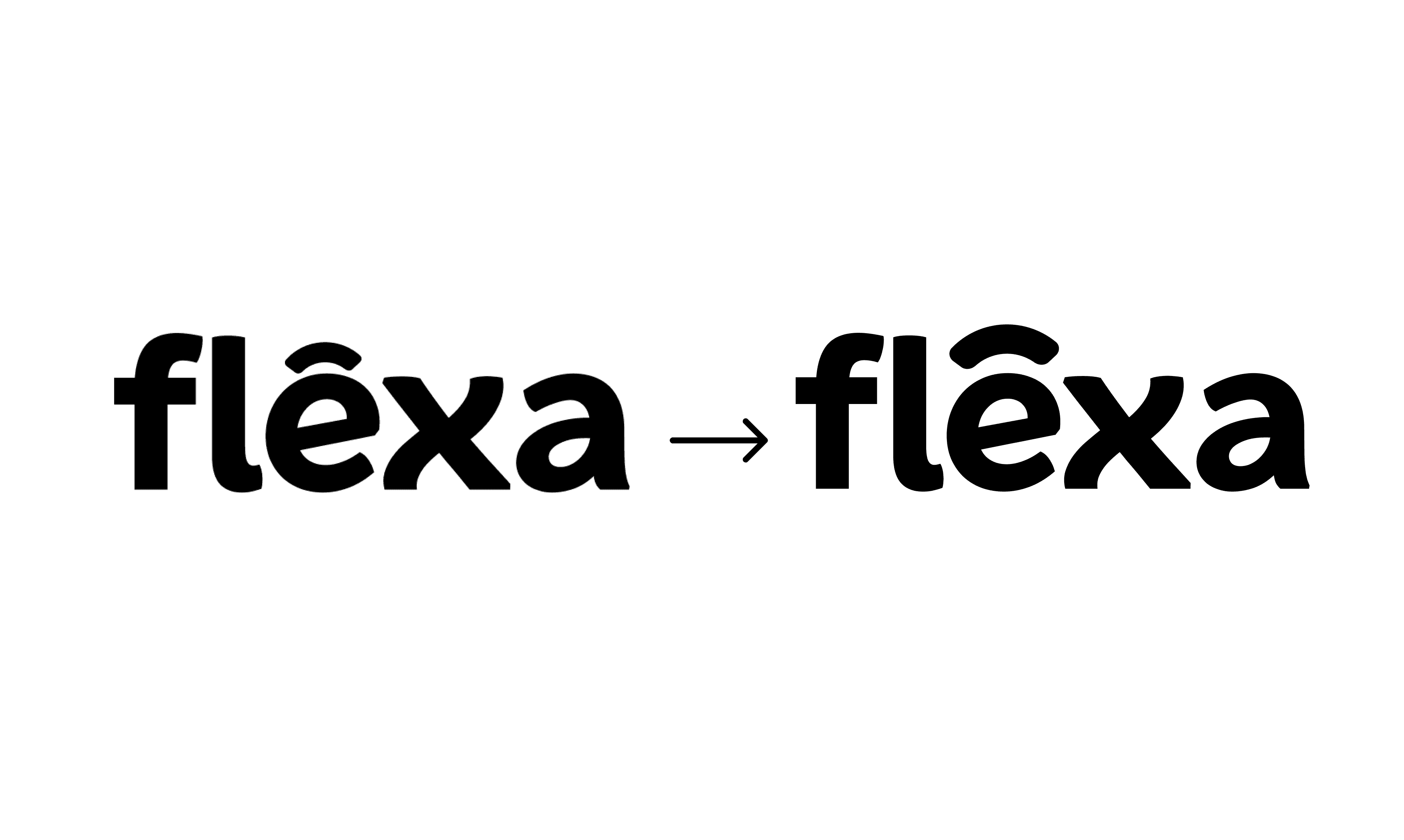
Moving into designing my app I used Figma to create a word mark and logo mark. I experimented with a number of shapes to create my Flexa brand. I chose the strongest design and began to toggle it using the pen tool to make a smooth bridge like shape. I did this to emphasise playing with words in my design. dmap exercise, I've distilled my core values. These five principles will shape my future endeavors.




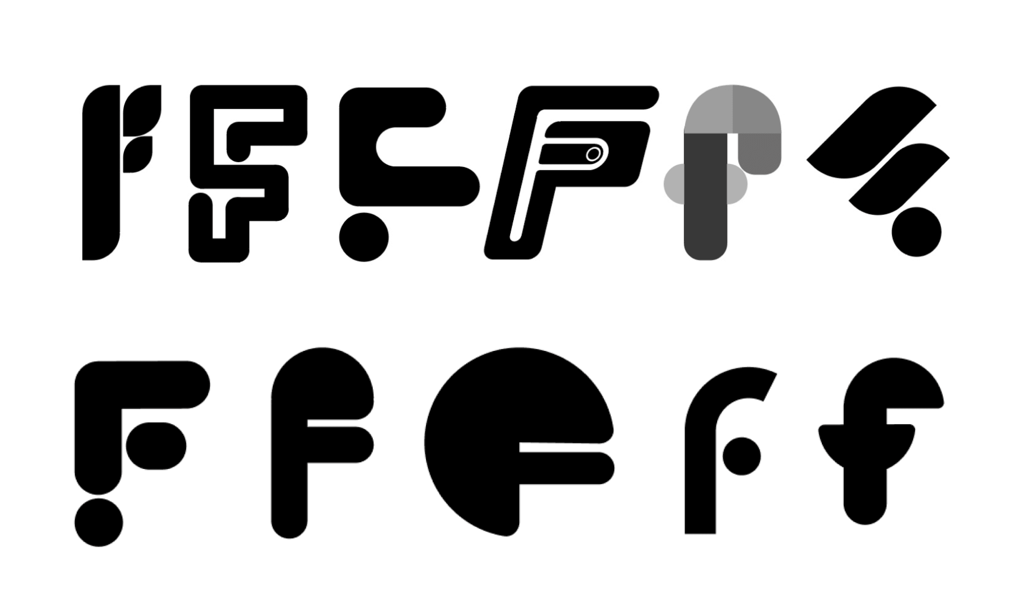

I generated some initial ideas focusing on simple shapes. Using Figma I primarily created these logo marks using rectangles, squares and circles.
I generated some initial ideas focusing on simple shapes. Using Figma I primarily created these logo marks using rectangles, squares and circles.
Application
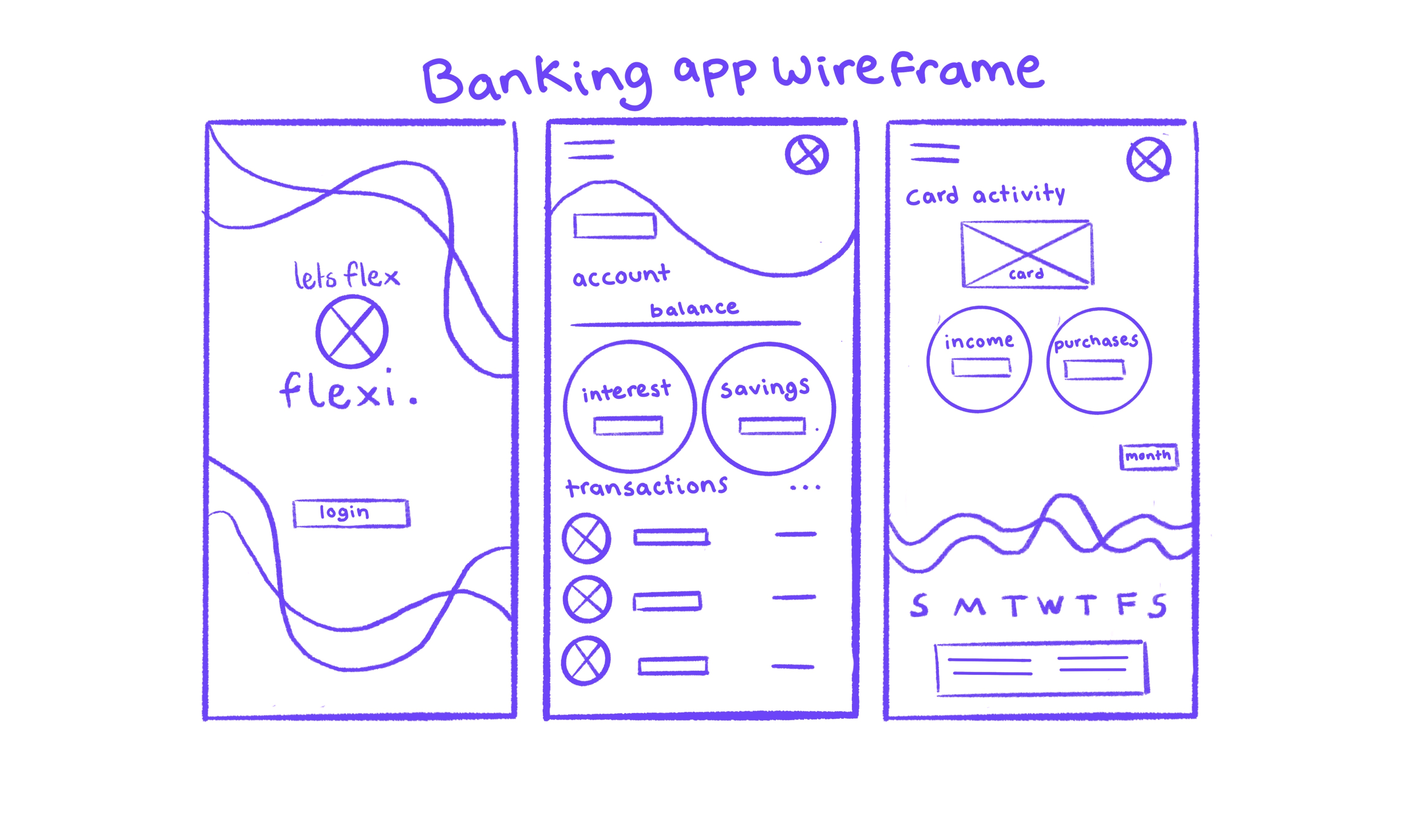
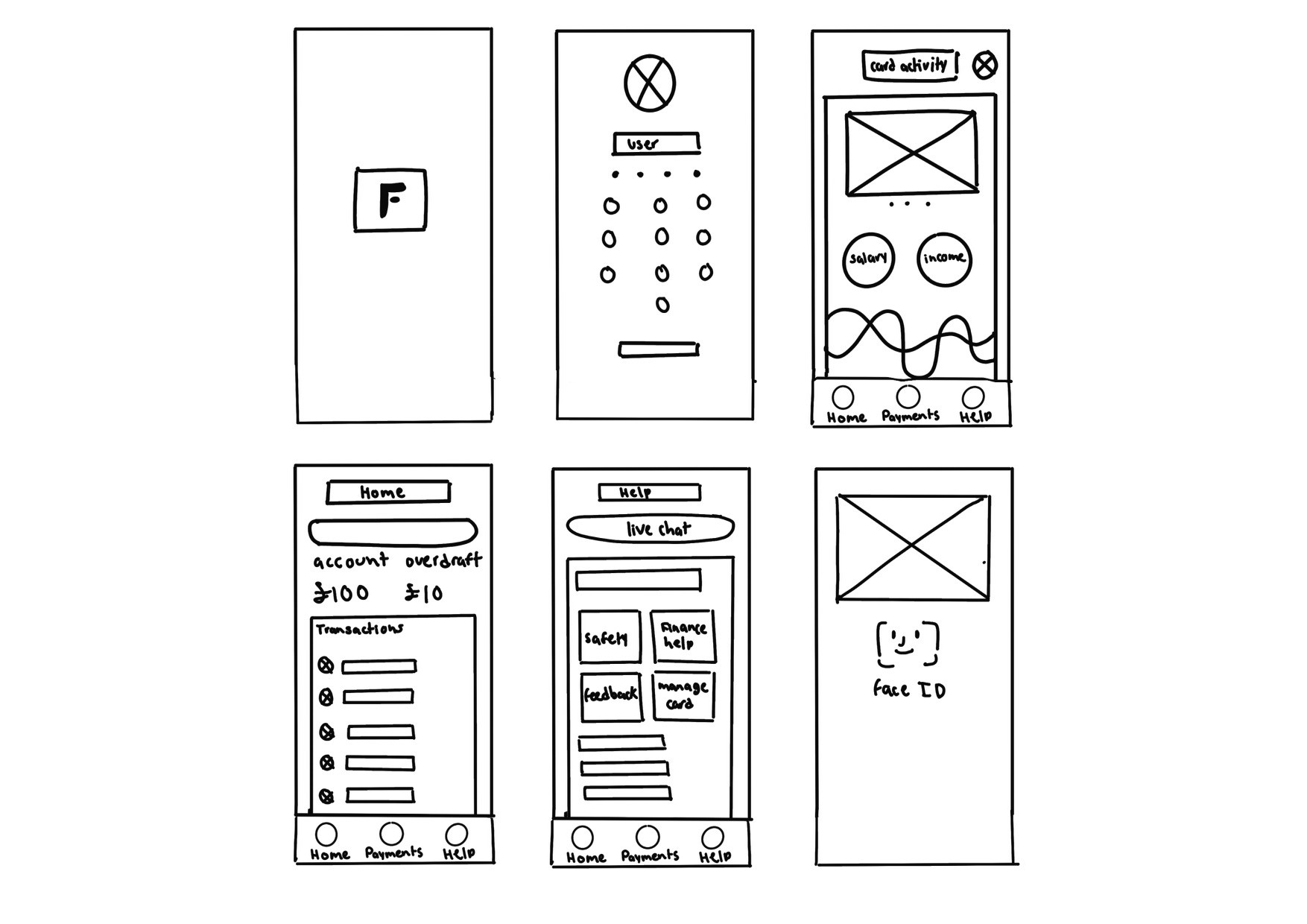
I then sketched out initial wireframes for my banking app. Beginning with three, then creating the rest of the screens using my notes and bullet points I gathered as a guide. This gave me a clear vision on how my app would look digitally.
Application
I then sketched out initial wireframes for my banking app. Beginning with three, then creating the rest of the screens using my notes and bullet points I gathered as a guide. This gave me a clear vision on how my app would look digitally.
Application
I then sketched out initial wireframes for my banking app. Beginning with three, then creating the rest of the screens using my notes and bullet points I gathered as a guide. This gave me a clear vision on how my app would look digitally.




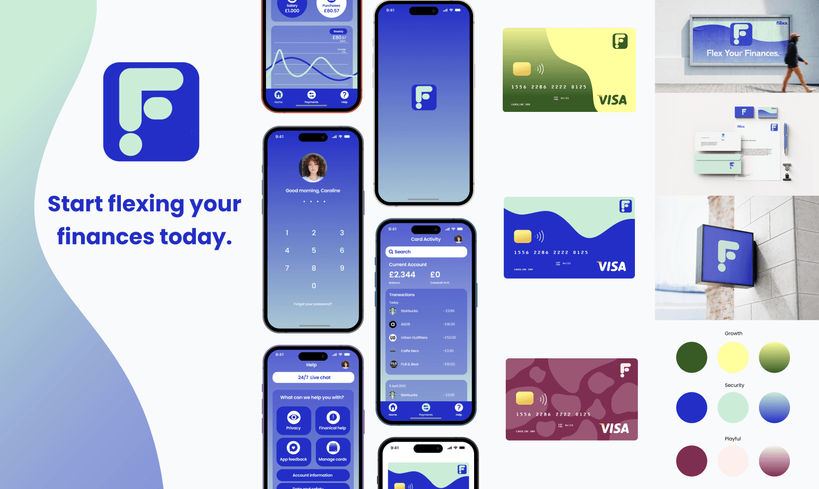
I then digitally designed my app using figma and created touchpoints for my banking app establishing a colour palette. I really enjoyed this part of the project as it gave me a chance to experiment with colour.
I then digitally designed my app using figma and created touchpoints for my banking app establishing a colour palette. I really enjoyed this part of the project as it gave me a chance to experiment with colour.


Reflection
Creating the banking app was enjoyable, especially diving into icon design. Keeping things simple improved the overall look. Exploring real banks helped me learn about more information, giving me an idea into who the target users are. I gained valuable Figma skills in prototyping and components, along with better use of the pen tool. Overall, my design was strong, but research and development could be a focus. To stay on track, I'd use a diary or to-do list for future projects. Embracing last-minute changes is a natural part of design.
Reflection
Creating the banking app was enjoyable, especially diving into icon design. Keeping things simple improved the overall look. User research was a bit less engaging, but exploring real banks helped me learn. I gained valuable Figma skills in prototyping and components, along with better use of the pen tool.
Overall, my design was strong, but research and development could be a focus. To stay on track, I'd use a diary or to-do list for future projects. Embracing last-minute changes is a natural part of design.
© Caroline Orr 2023