Creating a Data Visualisation Dashboard.
Creating a Data Visualisation Dashboard.
Creating a Data Visualisation Dashboard.
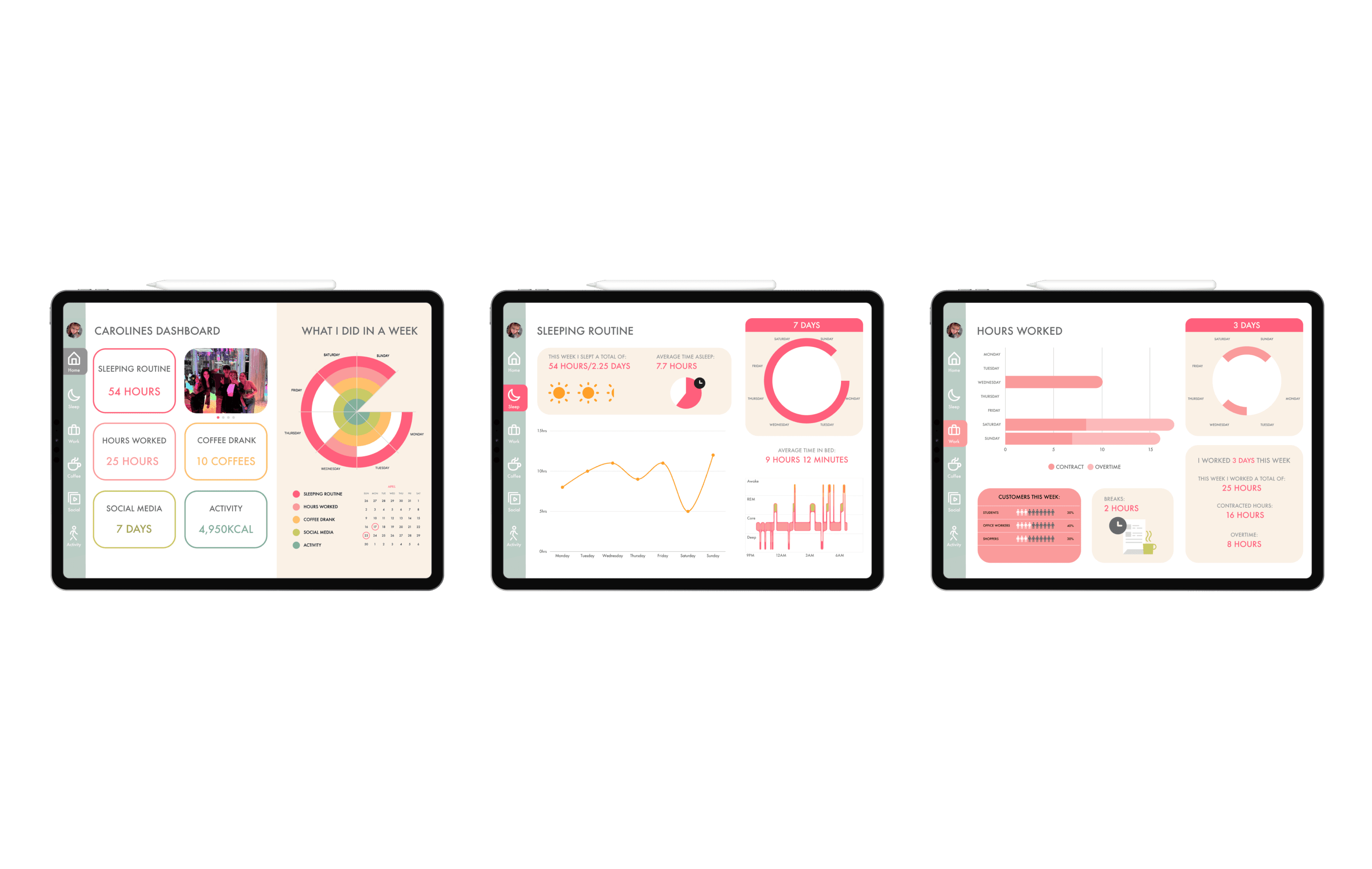

For this project we had to create our very own infographic dashboard based on a week in our lives. It has to be interactive, be aligned correctly and readable. You can also view the prototyped version here: https://shorturl.at/mnAZ9
For this project we had to create our very own infographic dashboard based on a week in our lives. It has to be interactive, be aligned correctly and readable. You can also view the prototyped version here: https://shorturl.at/mnAZ9
For this project we had to create our very own infographic dashboard based on a week in our lives. It has to be interactive, be aligned correctly and readable. You can also view the prototyped version here: https://shorturl.at/mnAZ9
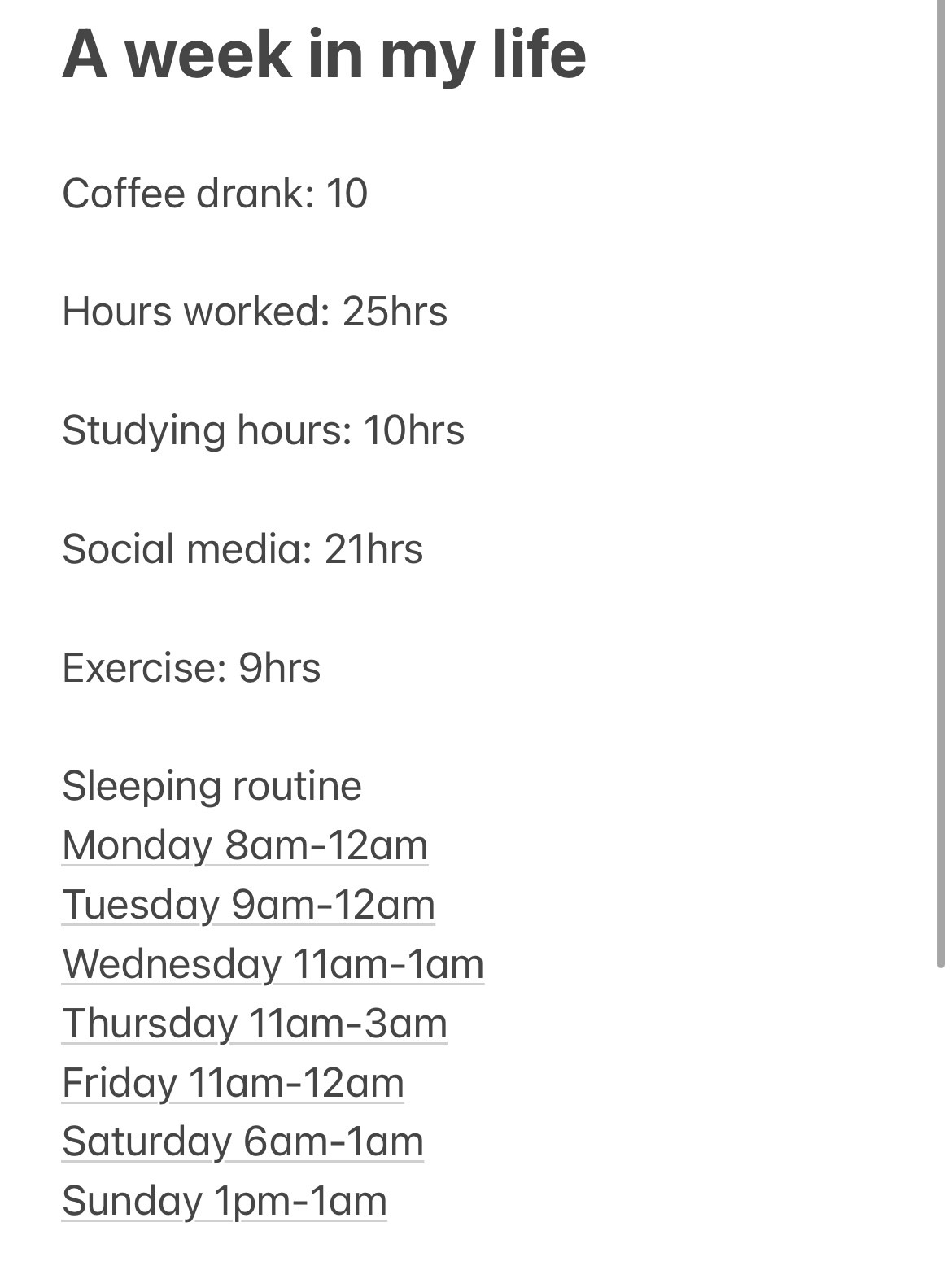
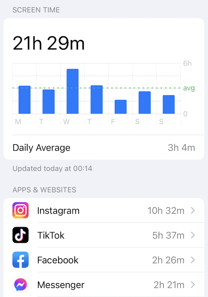
I chose to start by assessing my screen time and kept a record of the duration I spent on each application. Unsurprisingly, Instagram topped the list as my most frequently utilized app. Concerningly, on an average week, I dedicate almost an entire day to scrolling through social media. I also maintained a journal of the most crucial activities of my week. During this particular week, I couldn’t indulge in any social gatherings outside work, as I was occupied catching up on my project tasks. I re-joined the fitness center, which contributed to a sense of improved health. Regarding my sleep schedule, it's quite erratic. This week, due to spring half-term, my work timings extended beyond the norm, resulting in some extra hours. After a prolonged hiatus, I ventured back into the world of social media by making a post on Instagram for the first time in a while, requiring me to draft a post and respond to comments.
Data collection




I created a mind map to search out what values mean the most to my banking brand. Brainstorming helped me discover what five values meant the most to my brand.
After my mindmap exercise, I've distilled my core values. These five principles will shape my future endeavors.
Creating my visual data analysis


Things that didn't work
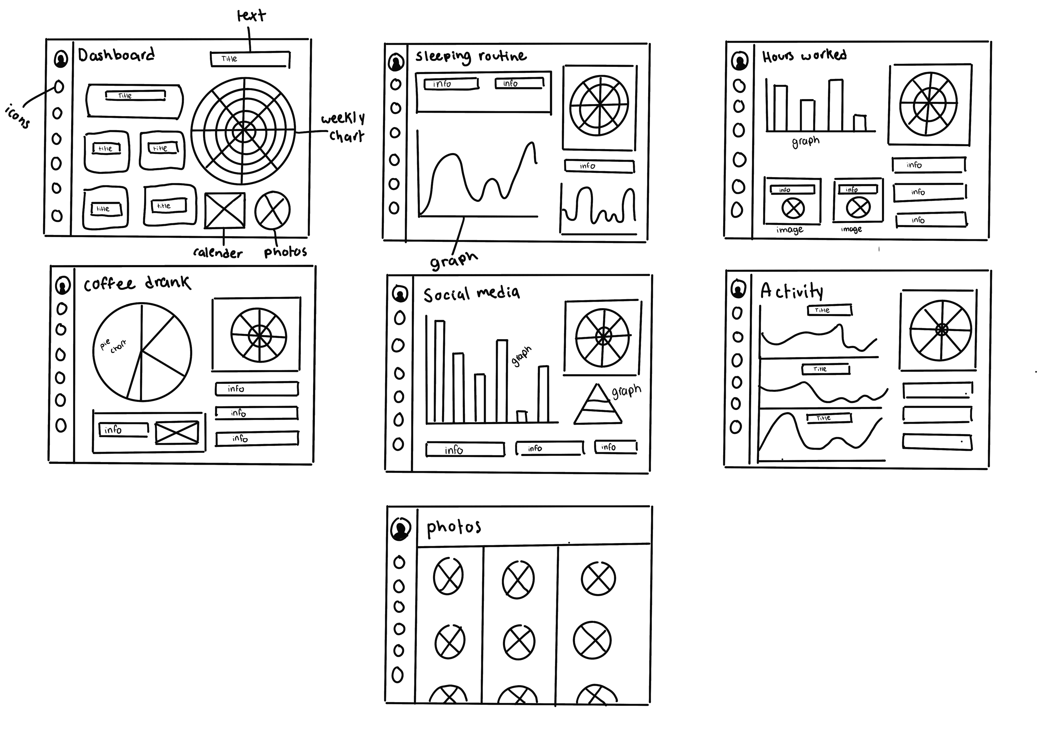
I was the first person in critique week and I had a lot of things that needed changed, firstly my alignment was incorrect so I went ahead and fixed it. My lecturer then pointed out that my icons needed text and the graphs were too small for the boxes, instead he said to remove the graphs and write the most important information as the titles. He also mentioned that the colour choice was nice but too similar in tone. At this point I saw my other classmates work and began to panic as i didn’t have as much interaction in my dashboard as I would have liked. So after critique I went away with all this new information and began to recreate my design.
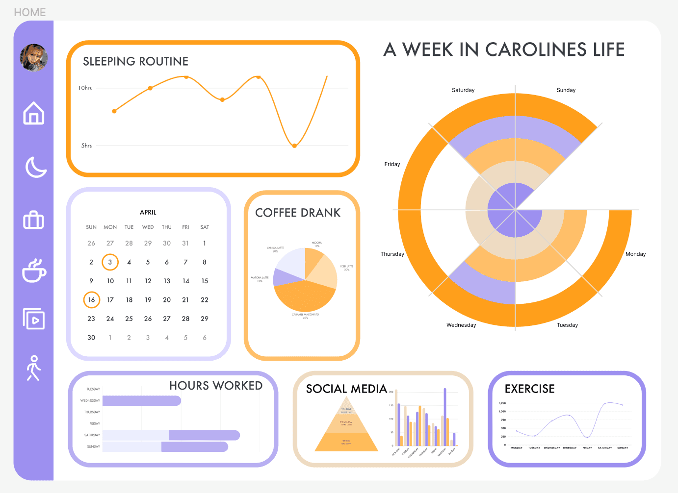


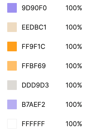
The colour palette initially looked great but after designing it on the graph the orange tones were too similar and morphed together. Therefore I decided to change my colour choice to be user friendlier.
The colour palette initially looked great but after designing it on the graph the orange tones were too similar and morphed together. Therefore I decided to change my colour choice to be user friendlier.
Changing my colour palette
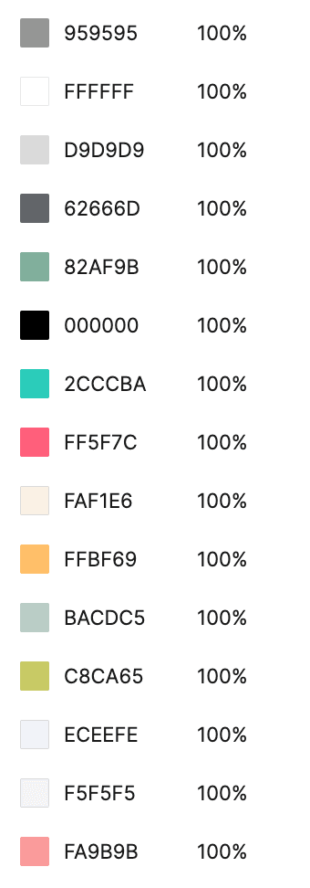
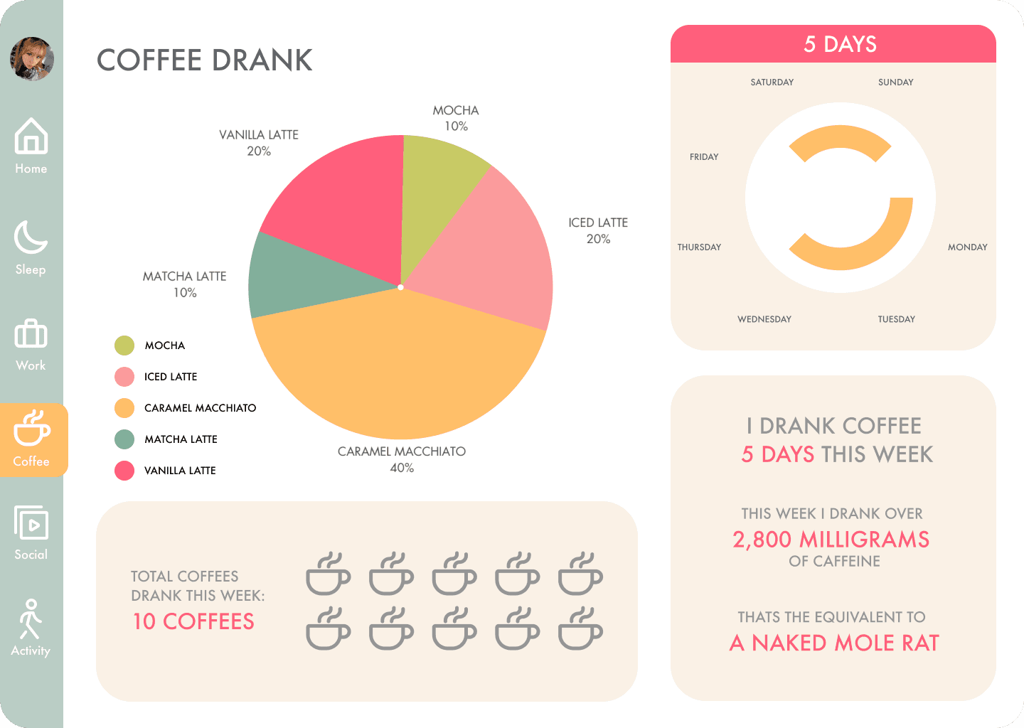
As one of the things I needed to adjust from critique was colour I decided to completely change it. I found this colour palette on Pinterest and fell in love with the muted tones. It felt vibrant and easier to understand with the different contrast in colour. Below is an updated frame of my dashboard and I am very pleased with this result and I am glad I changed my mind at the last minute.




Prototyping my dashboard
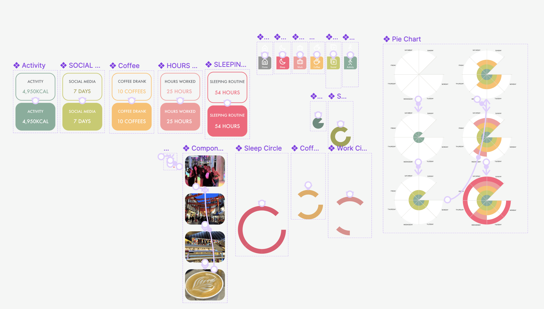
I began to prototype my dashboard watching youtube videos. I created many types of components as seen below. I created a carousel slideshow of photos, interactive buttons and a interactive graph that is clickable. I then linked each frame together and overall I am proud of myself for doing this as I had no idea what prototyping was in January when we started this second semester.


Reflection
I went into this project thinking we had to create a illustrative infographic and soon realised it was was more so a dashboard similar to the ones you find on instagram. I will be honest and admit I found this project difficult, I feel I got confused with all the data and felt overwhelmed with information. As seen above I had to go back and change my idea a week before hand in which made me stressed as I had a limited time. I fee like this task was quite a lot for the limited time we had and I think I would’ve enjoyed this project more if i had a extra few weeks to work on it as I lost a week going to the creative leadership programme. Overall I am very happy with what I could achieve in a few weeks and I learned so many new things that I didn’t know before such as making a carrousel of photos as a component and in general how to prototype. I have learned its never too late to change your mind and its perfectly normal to make mistakes along the way. No design process is a straight line.
© Caroline Orr 2023