Creating a UV detector for a smartwatch
Creating a UV detector for a smartwatch
Creating a UV detector for a smartwatch
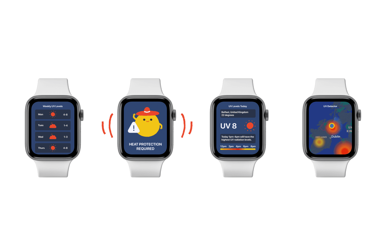

Smartwatch
I was challenged to design a smartwatch user interface in which I had to come up with a innovative app. We were assigned 3 weeks to gather research, develop our idea and present our app to the class. Preview Figma version here: https://shorturl.at/wHK57
I was challenged to design a smartwatch user interface in which I had to come up with a innovative app. We were assigned 3 weeks to gather research, develop our idea and present our app to the class. Preview Figma version here: https://shorturl.at/wHK57
I was challenged to design a smartwatch user interface in which I had to come up with a innovative app. We were assigned 3 weeks to gather research, develop our idea and present our app to the class. Preview Figma version here: https://shorturl.at/wHK57
Research
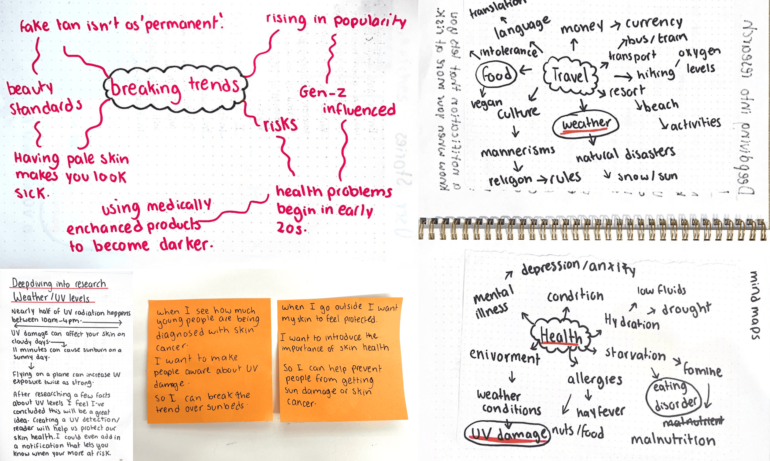
I began this project by exploring smartwatch UI. I went into this project with no knowledge of smartwatch design so this give me an idea on what I was working with. I began creating mind maps into categories that may be of interest focusing on the words that captured my attention.
After brainstorming I realised there was a lack of websites or apps informing users on UV radiation, it was also a personal topic and I felt inspired to create a UV app. I went into extensive research on the topic and created mind maps on hot topics that are currently a problem.


Sketching
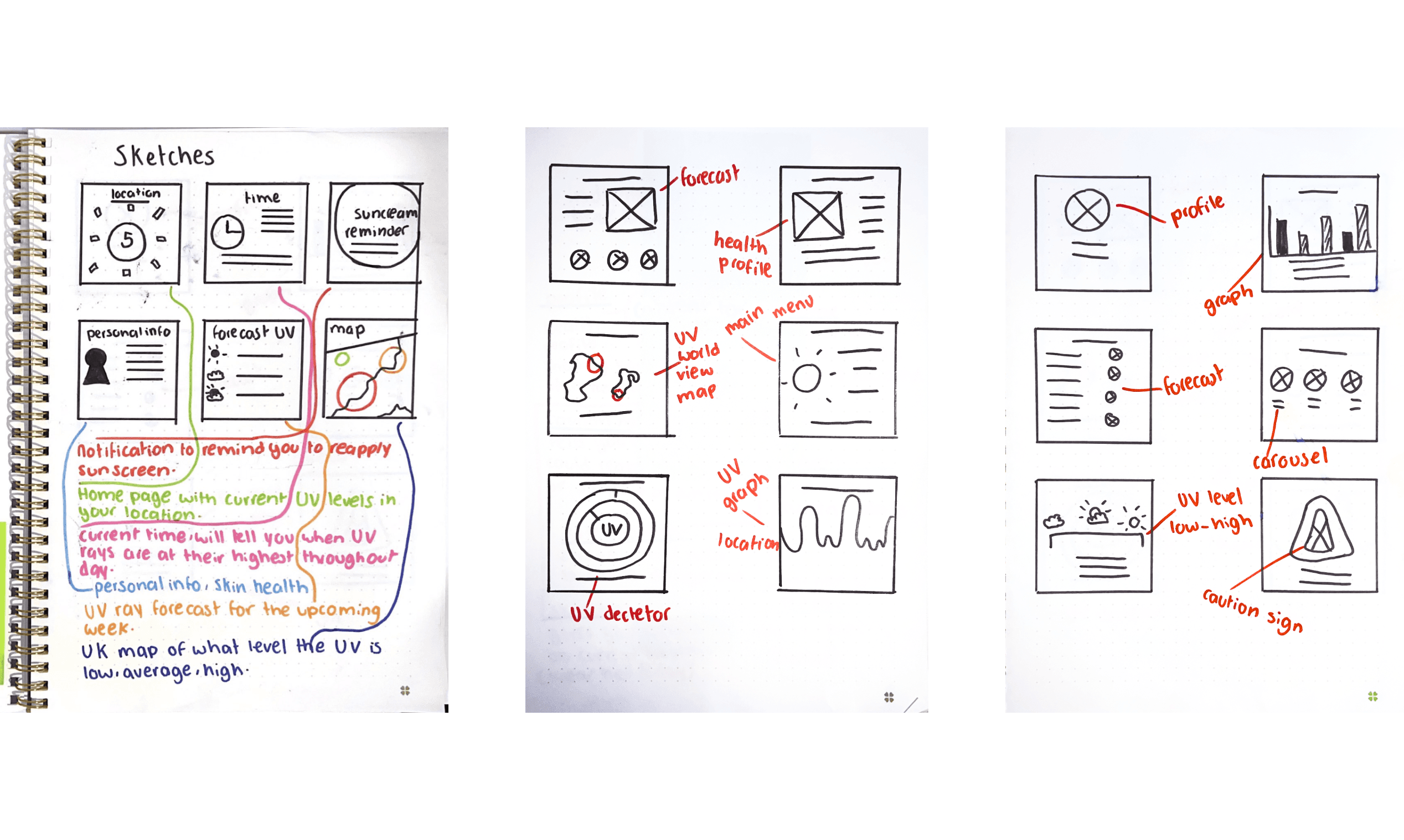
After my mindmap exercise I created user stories and began creating rough wireframes using the crazy 8 exercise. This gave me a clear idea on what areas I wanted to focus on.
Sketching
I used the Crazy 8 exercise to quickly sketch out wireframes for my smartwatch interface. Then, I took detailed notes on what each screen should include. This helped me plan the design better, ensuring everything was purposefully placed. This approach laid a strong foundation for the next stages of development, balancing both functionality and aesthetics.
Sketching
After my mindmap exercise I created user stories and began creating rough wireframes using the crazy 8 exercise. This gave me a clear idea on what areas I wanted to focus on.


Application
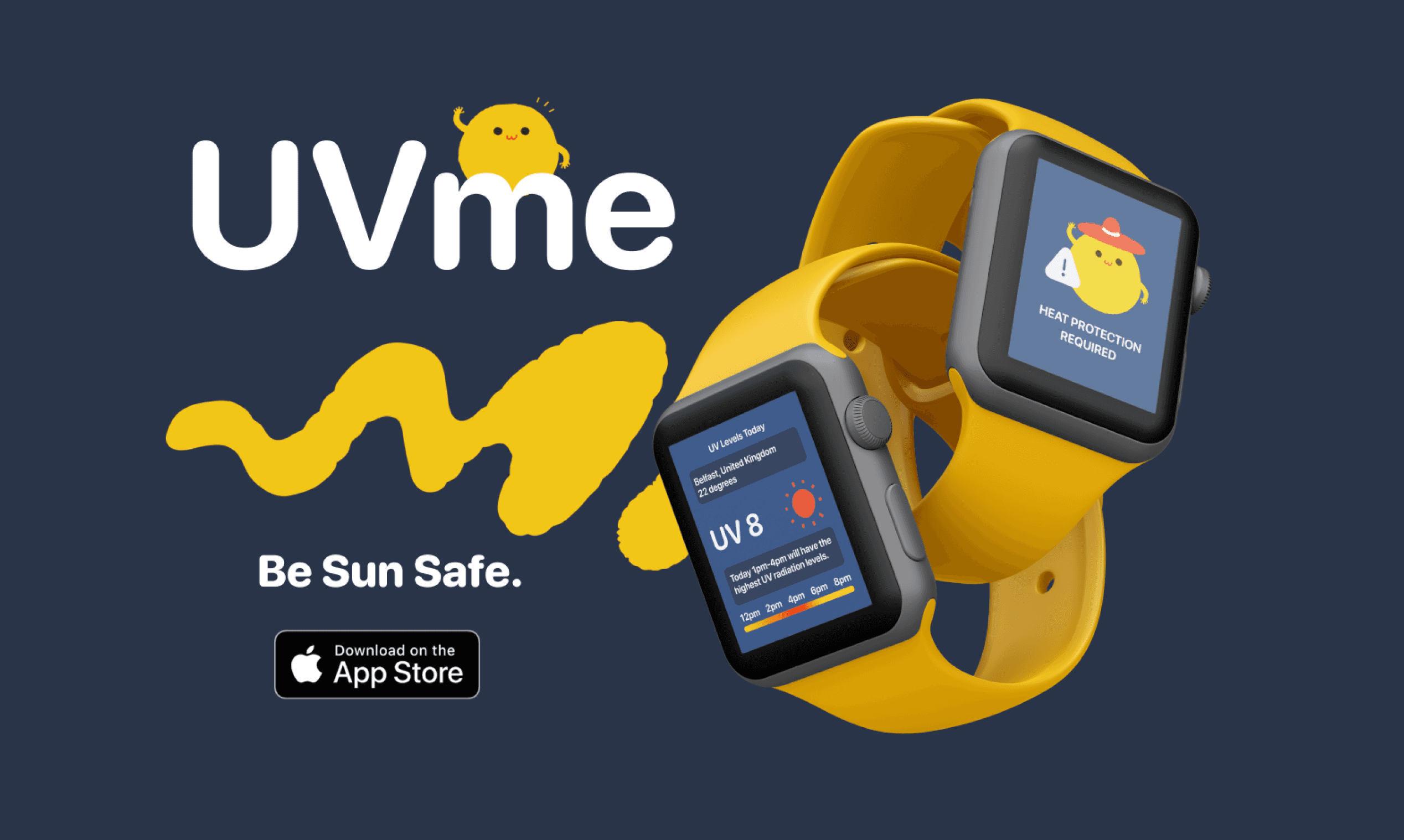
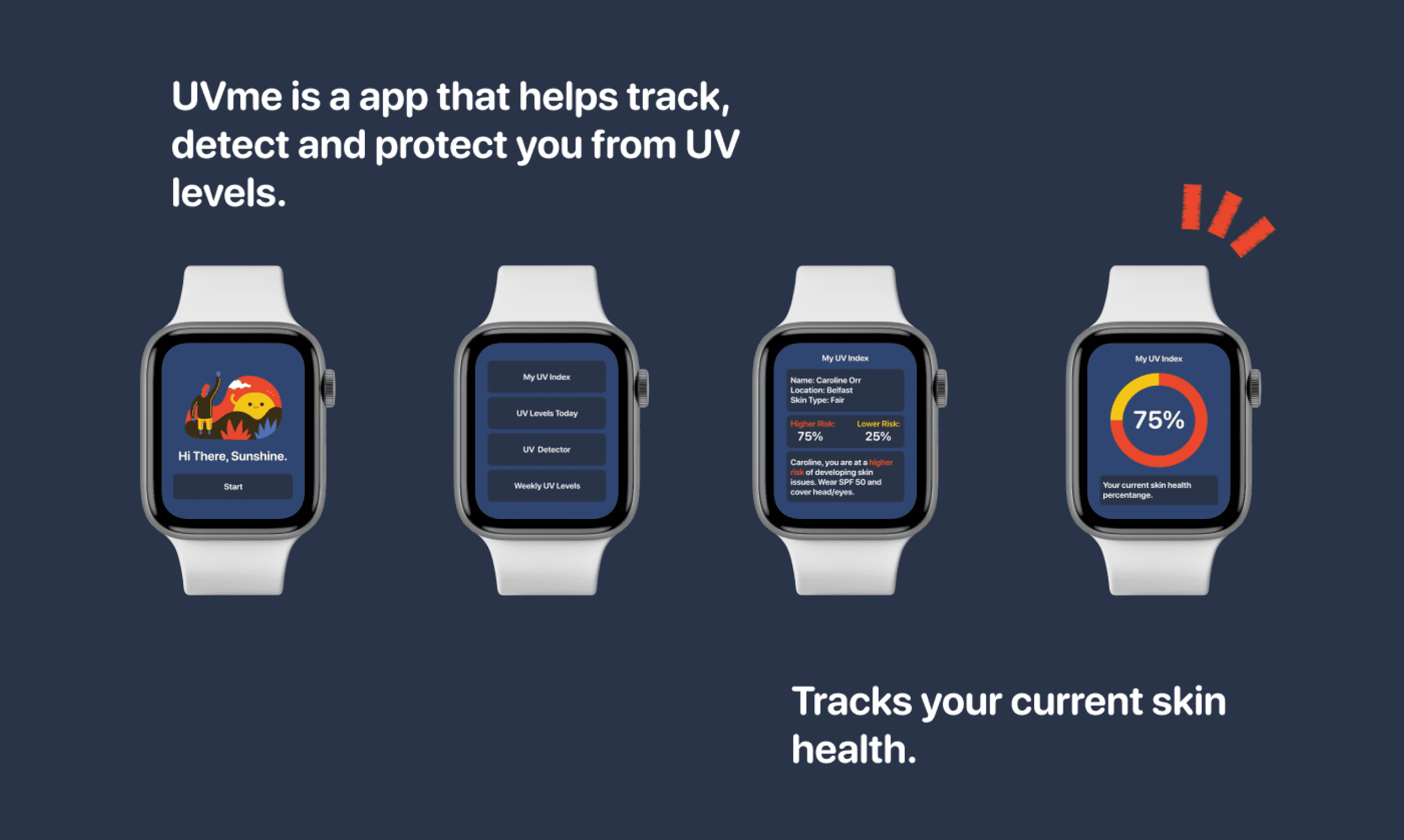
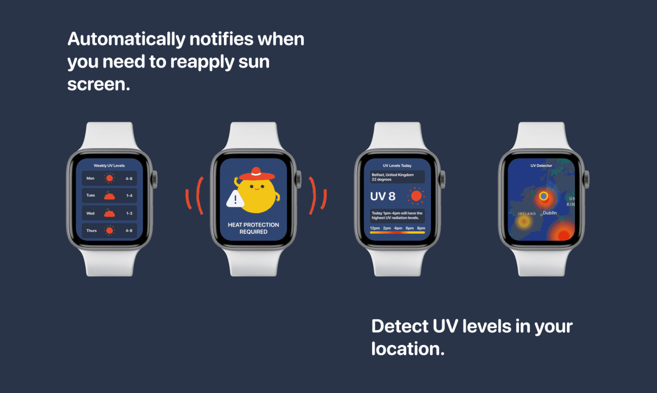
As I was on a limited time period with this project I decided to use stock images for my UI. As the apple smartwatch has a dark display I decided to keep my colour palette dark as it makes it readable and user friendly. I created a catchy name for my app. I pitched my idea to the class explaining my motives behind why I decided to create a UV level smartwatch app.






Reflection
I thoroughly enjoyed working on this project. It gave me valuable insights into designing for smaller screens, where space is limited. The research phase was immersive, providing a rich source of inspiration. This comprehensive approach laid a strong foundation for the creative process. Generating and refining ideas was a captivating exercise, resulting in a cohesive and impactful outcome. This experience deepened my appreciation for designing on a smaller canvas.
© Caroline Orr 2023